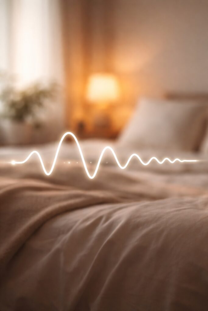
Calming color palettes for sleep play a far greater role in wellbeing than many people realise. In the bedroom especially, colour influences how quickly the mind unwinds, how the body responds to rest, and how easily sleep comes at the end of the day.
Sleep is no longer viewed as a luxury. It is an essential part of health, and increasingly, the way our homes are designed is recognised as shaping how well we rest.
This guide explores the science behind sleep inducing decor, explaining which colours promote rest, which disrupt it, and how to create a bedroom palette that feels both soothing and timeless.
How Colour Affects the Brain and Nervous System
The human brain responds to colour before it processes form or detail. Colour influences emotional state, stress levels, and even heart rate, often without conscious awareness. In a sleep environment, this matters.
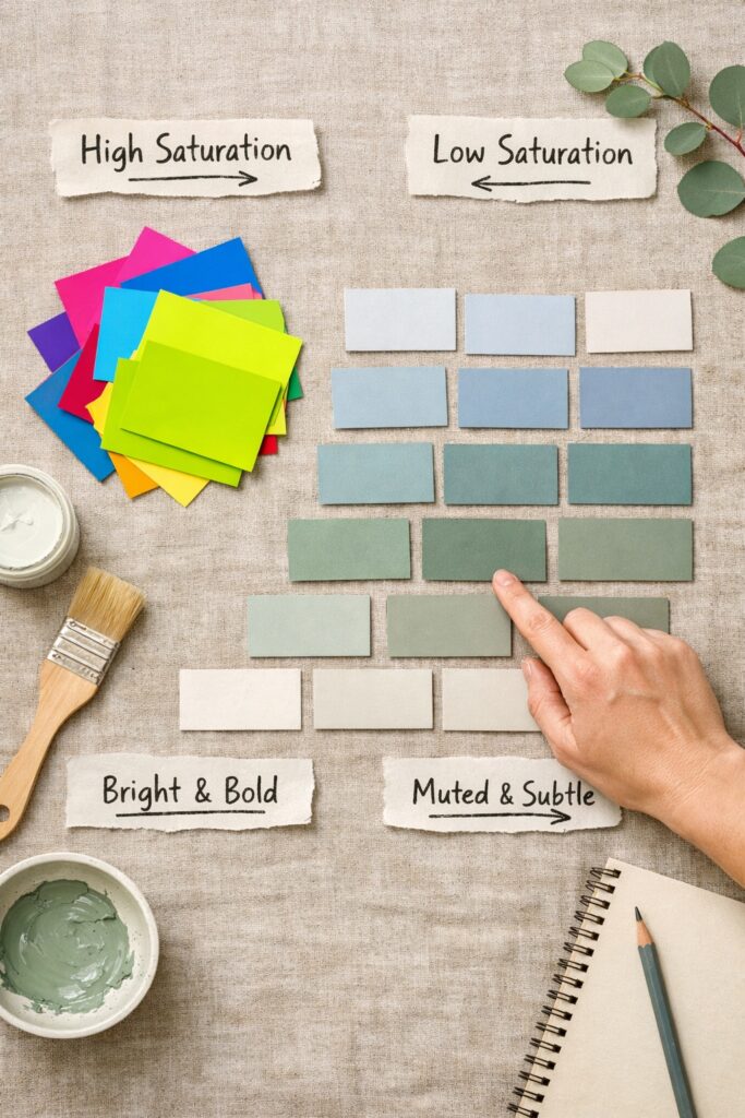
Highly saturated or contrasting colours stimulate the brain, increasing alertness rather than encouraging relaxation. Softer, muted tones tend to lower visual noise, helping the nervous system shift out of a heightened state and into one that supports rest.
Colour influences emotional response long before we consciously register it, which is why understanding the psychology behind different shades is so important when designing for rest. Our guide to the psychology of color and the best paint shades for relaxation explores this connection in more detail.
This is why bedrooms that feel visually busy or overly bold can make it harder to unwind, even if the decor looks appealing during the day. Calm is not just about darkness or softness, but about reducing unnecessary stimulation.
Research into how colour influences mood and behaviour shows that visual environments can affect emotional regulation and stress levels, a relationship explored by the British Psychological Society.
What Makes a Colour Sleep Inducing
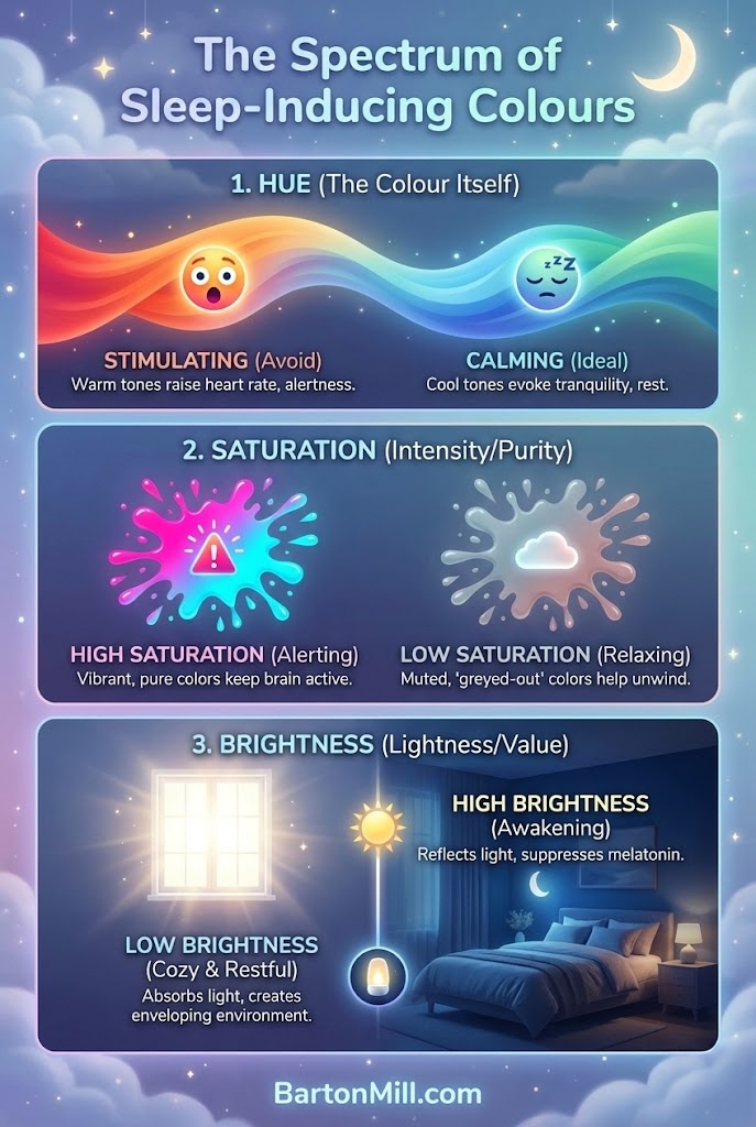
Not all calm colours are created equal. Three characteristics play a key role in how sleep friendly a colour feels.
When designing calming color palettes for sleep, low saturation and gentle contrast are far more important than following colour trends.
Hue refers to the colour family itself, such as blue, green, or neutral tones. Saturation describes how intense or muted the colour appears. Brightness relates to how light or dark the colour feels.
Sleep inducing colours tend to be lower in saturation and moderate in brightness. They avoid sharp contrast and instead sit comfortably within a narrow tonal range. Warmth and coolness also matter. Cooler tones often promote calm, while overly warm or vivid shades can feel energising rather than restful.
Contrast is just as important as colour choice. Even calming hues can feel disruptive if paired with harsh whites or deep blacks.
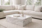
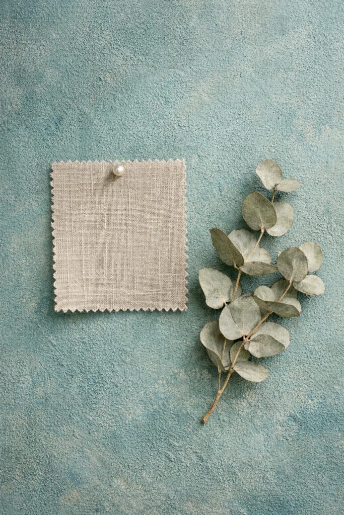
Soft Neutrals as the Foundation of a Restful Bedroom
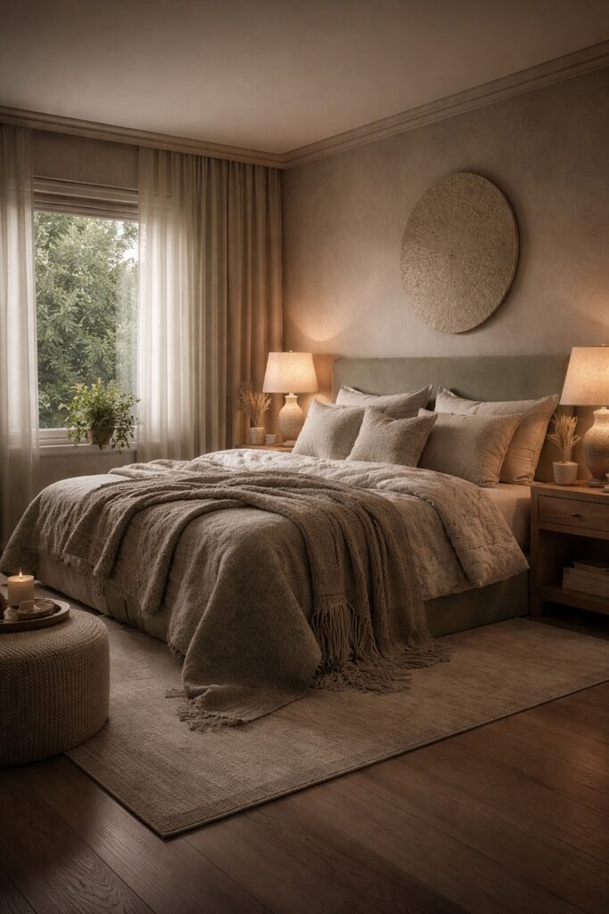
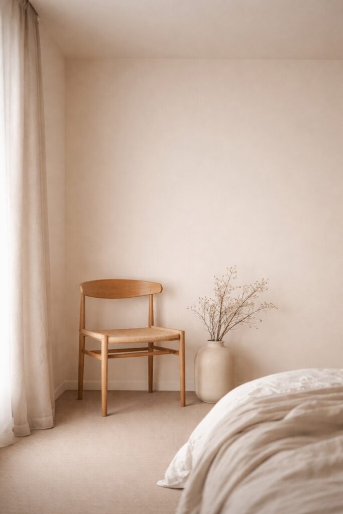
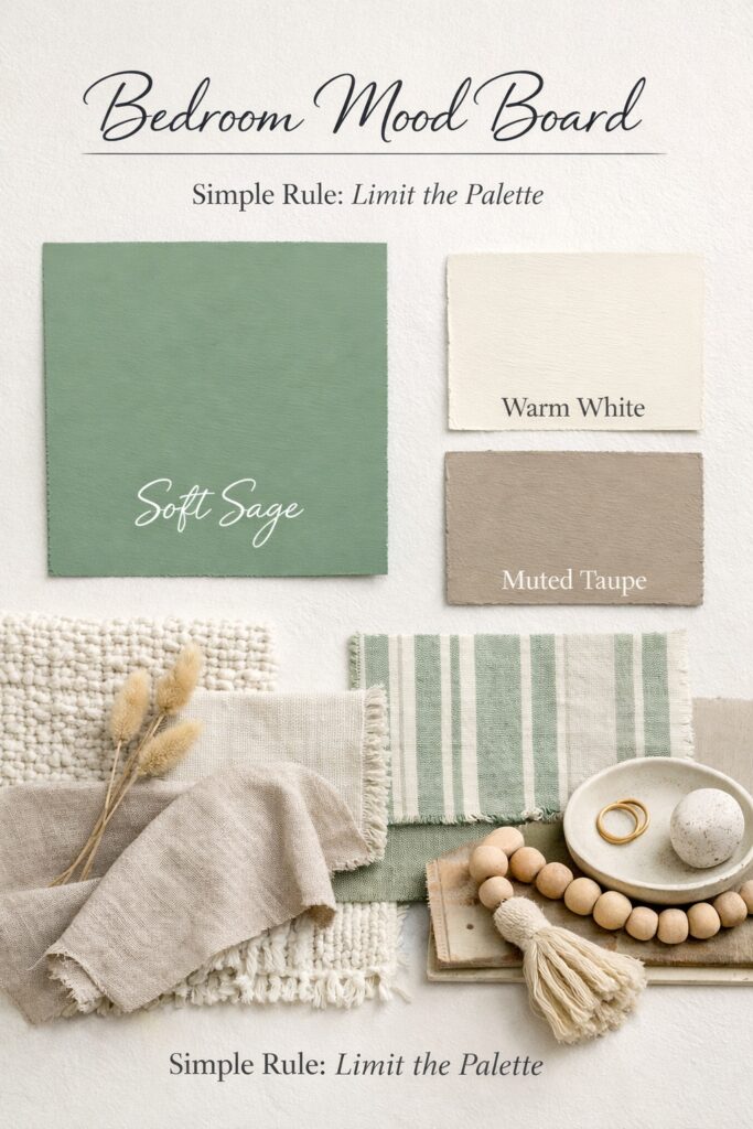
Neutral palettes form the backbone of many calming bedrooms. Warm whites, soft stone, greige, and muted taupe shades create an environment that feels settled rather than stark.
Stark white walls can feel clean but often appear harsh at night, especially under artificial lighting. Warmer neutrals soften the edges of a space, allowing the room to feel cocooning rather than clinical.
Neutrals work particularly well on larger surfaces such as walls and ceilings, where visual calm is most important. They also provide a flexible base for subtle colour layering through textiles and accessories.
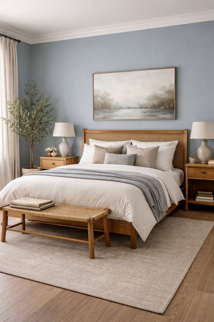
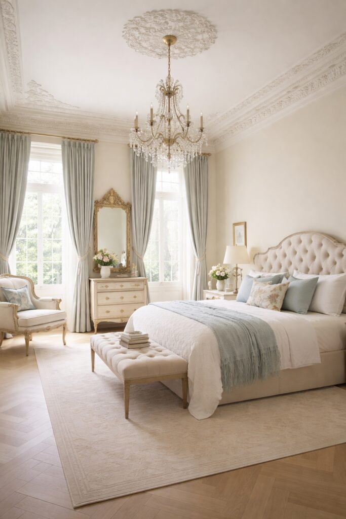
Blues and Blue Greens That Encourage Rest
Blue is often associated with calm, but not every blue supports sleep equally. Soft, greyed blues and blue greens are more effective than bright or highly saturated tones.
These colours are linked to reduced heart rate and lower levels of stimulation, making them well suited to bedrooms. Blue green shades, in particular, strike a balance between coolness and warmth, avoiding the cold or sterile feel that some blues can create.
Pairing these tones with natural materials such as wood, linen, or wool helps maintain warmth and depth.
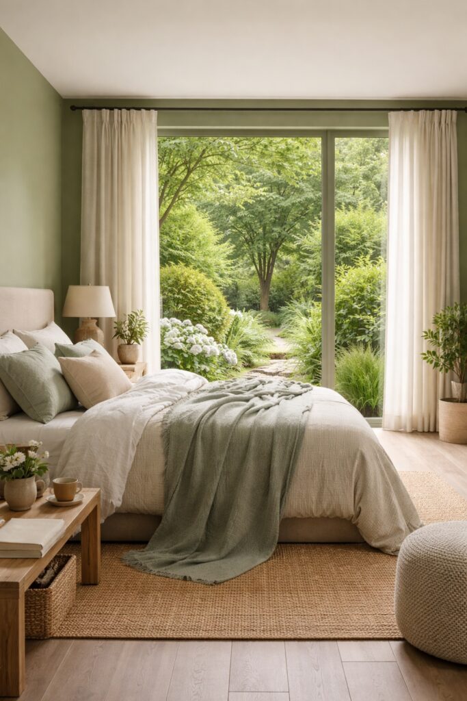
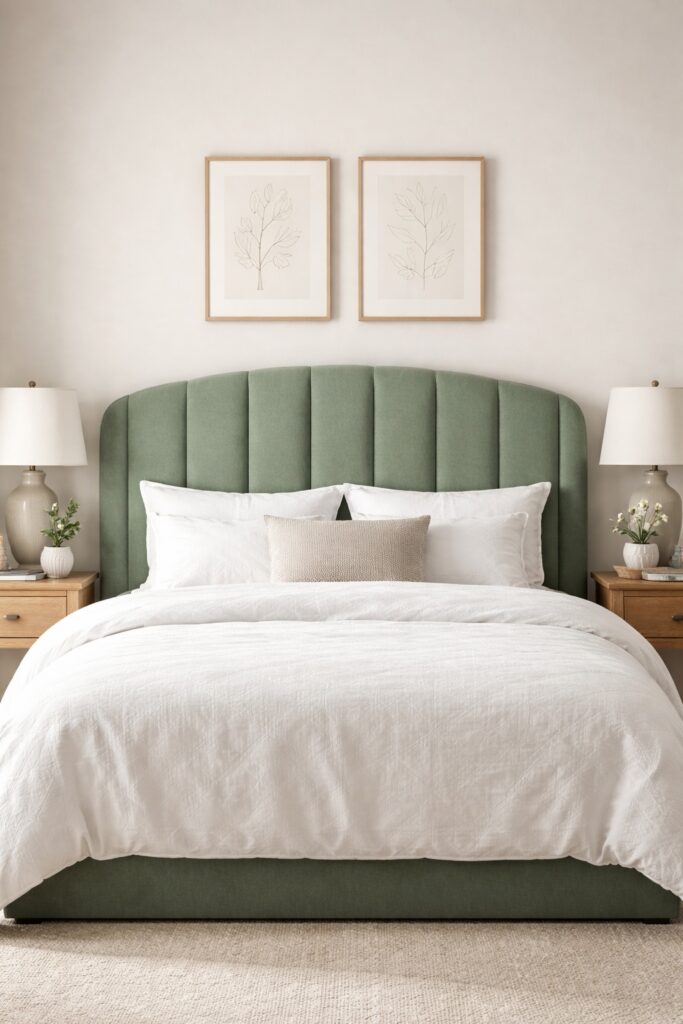
Nature Inspired Greens and Their Restorative Effect
Green sits at the centre of the visible colour spectrum, making it easier for the eyes to process. This is one reason green is often described as restful and grounding.
Muted greens inspired by nature, such as sage, olive, or eucalyptus, work particularly well in sleep spaces. These tones connect the interior to the natural world, subtly reinforcing feelings of safety and balance.
Green works well on walls, headboards, or soft furnishings, especially when paired with neutral bases. It is also a colour that ages gracefully, making it a strong long term choice rather than a trend driven one.
Nature inspired interiors are often associated with reduced stress and improved wellbeing, a principle supported by biophilic design research from Terrapin Bright Green.
Warm Earth Tones That Still Feel Calm
Warmth does not automatically mean stimulation. Soft earth tones can feel deeply calming when chosen carefully.
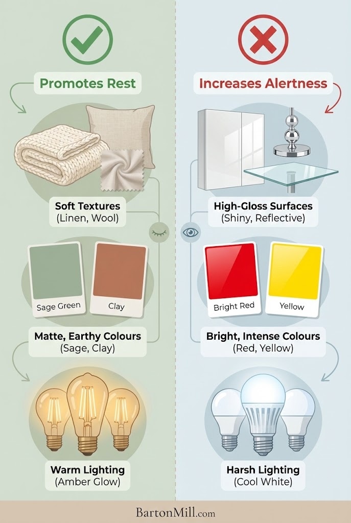
Shades such as sand, clay, and muted terracotta bring a sense of comfort and enclosure, which can be particularly effective in bedrooms that feel cold or impersonal. The key is restraint. These colours should remain soft and desaturated, avoiding strong reds or oranges that increase alertness.
Earth tones work best when layered gently through textiles, feature walls, or accent furniture rather than dominating every surface.
Colours to Use With Caution in Sleep Spaces
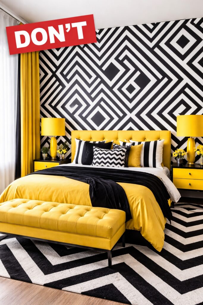
Some colours are better reserved for daytime areas. Bright reds and oranges are associated with energy and stimulation, making them unsuitable for rest focused rooms.
High contrast black and white schemes can feel visually jarring, particularly under artificial light. Vibrant yellows, neon shades, and overly saturated colours also tend to disrupt visual calm.
This does not mean these colours must be avoided entirely, but they should be used sparingly and thoughtfully, if at all, in bedrooms.
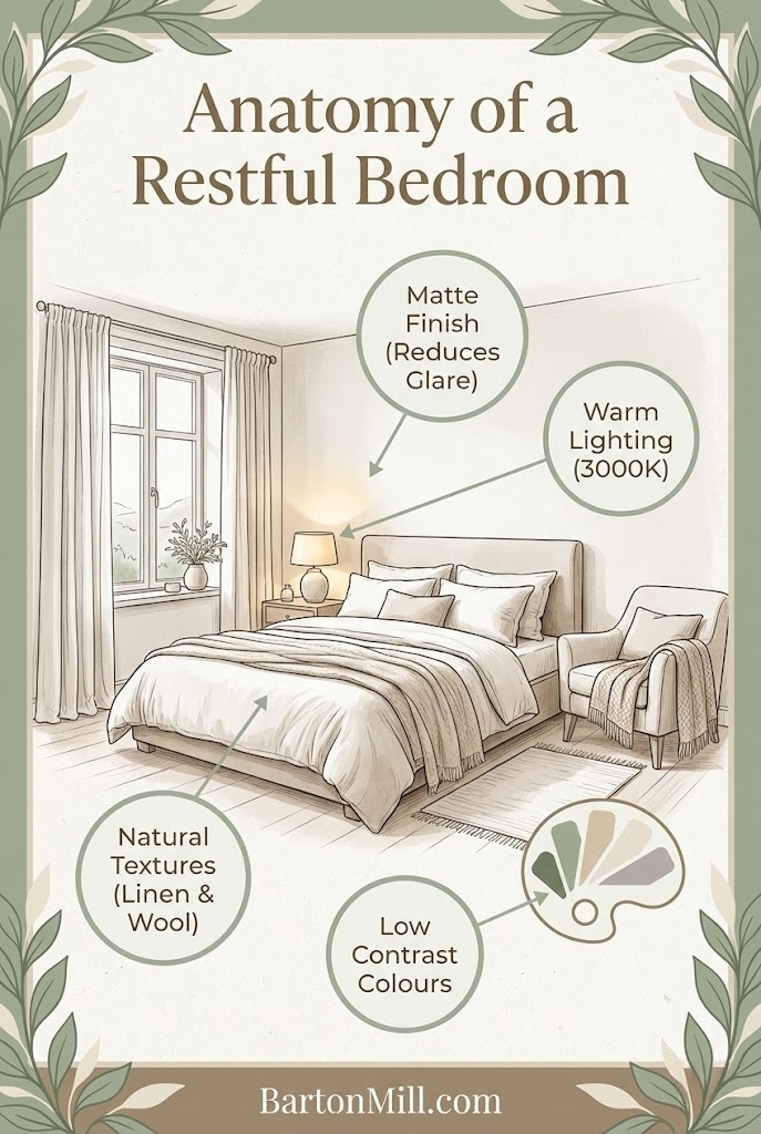
Why Lighting, Finish, and Texture Matter as Much as Colour
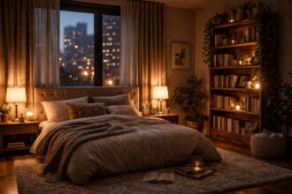
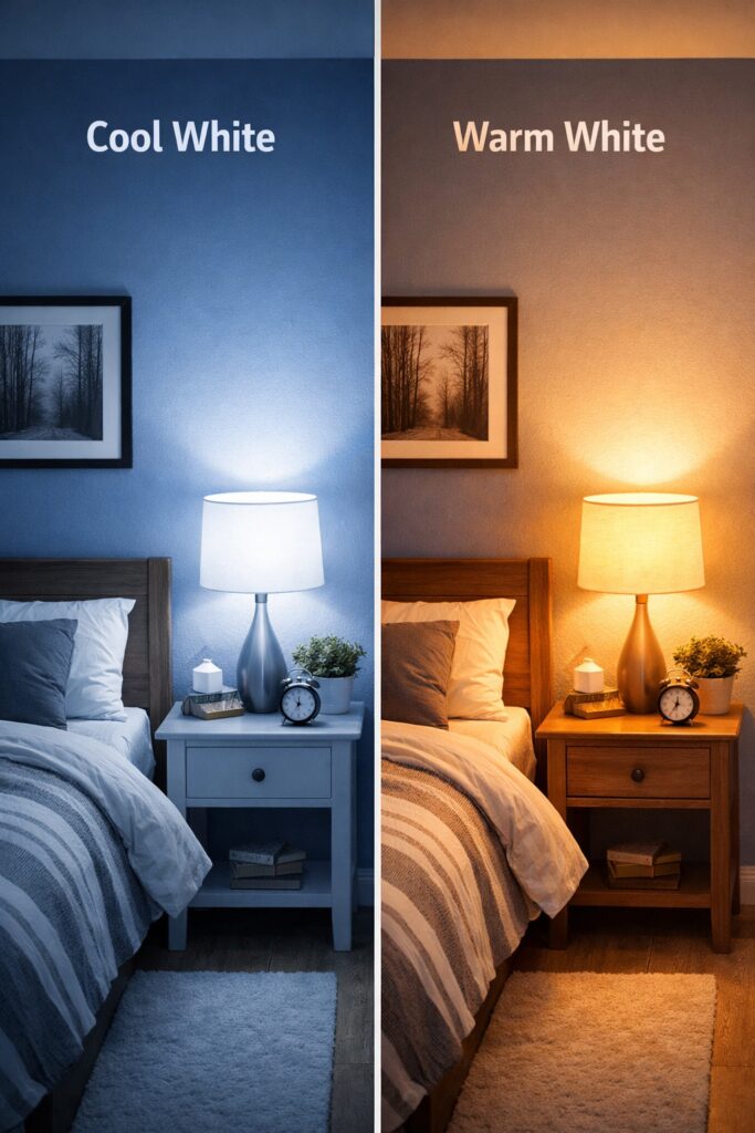
Colour does not exist in isolation. Lighting temperature dramatically alters how a colour appears, especially at night. Cool lighting can make even warm tones feel harsh, while warmer lighting enhances softness and depth.
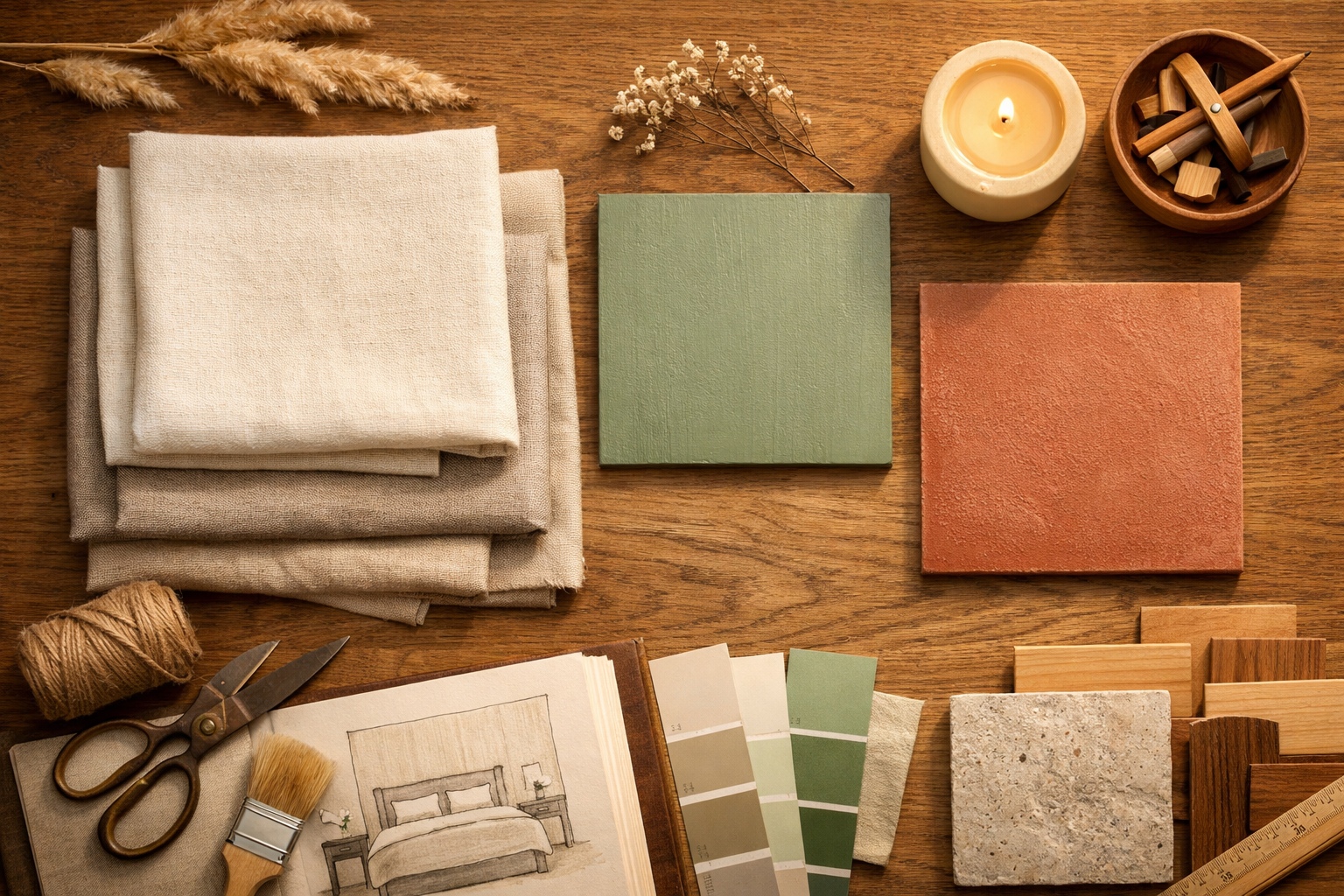
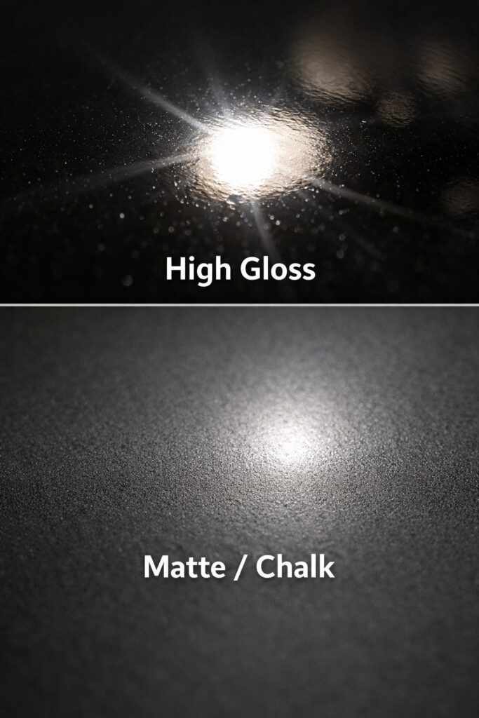
Matte finishes reduce glare and visual noise, supporting calm palettes more effectively than gloss or high sheen surfaces. Texture also plays a role. Soft furnishings, layered textiles, and natural materials absorb light and soften the overall feel of a room.
The temperature of light has a significant impact on how calming colours appear after dark. Warmer lighting enhances softness, while cooler lighting can make even gentle tones feel harsh. If you want to explore this in more detail, our colour temperature selector tool breaks down how different lighting temperatures affect interior spaces.
A calming bedroom relies on a combination of colour, finish, and lighting working together rather than any single element.
Visual calm is only one part of a restful bedroom. Reducing sensory disruption also plays a role, particularly in busy homes or city settings. This is explored further in our article on creating a sanctuary through soundproofing tips for urban bedrooms.
Creating a Cohesive Sleep Friendly Colour Scheme
The most restful bedrooms usually follow a simple rule. One dominant calming colour is supported by one or two complementary tones, rather than a wide palette.
Limiting contrast, repeating colours across surfaces and textiles, and maintaining consistency throughout the room helps reinforce visual calm. This approach mirrors broader design principles discussed in our guide to mixing modern and traditional styles in a period property, where cohesion is prioritised over statement contrasts.
For bedrooms within older homes, colour choices should also respect architectural features. Soft palettes allow period details to breathe without overwhelming the space.
In older homes, calming colour palettes are most effective when they work with original features rather than against them. This balance is explored in our guide to mixing modern and traditional styles in a period property.
What is the best colour palette for sleep?
The best colour palettes for sleep are made up of soft, muted tones with low contrast. Gentle neutrals, pale blues, blue greens, and nature inspired greens tend to support relaxation by reducing visual stimulation and helping the nervous system wind down.
Is blue really the best colour for sleep?
Blue is often associated with calm, but not all blues are equally sleep friendly. Softer, greyed blues and blue greens work best. Bright or highly saturated blues can feel cold or energising, especially under artificial lighting, so tone and finish matter as much as colour choice.
Are dark bedroom colours bad for sleep?
Dark colours are not inherently bad for sleep, but they need to be used carefully. Deep, muted tones can feel cocooning and restful when balanced with soft lighting and lighter accents. High contrast dark schemes, however, can feel heavy or visually stimulating at night.
Can warm colours be calming in a bedroom?
Yes, warm colours can be calming when they are soft and desaturated. Shades like sand, clay, and muted terracotta can create a sense of comfort and enclosure. Bright reds, oranges, or strong yellows are more likely to feel stimulating and are best avoided in sleep spaces.
How does lighting affect calming colour palettes?
Lighting has a significant impact on how colours are perceived. Cool lighting can make calm colours feel harsh, while warm lighting enhances softness and depth. Layered lighting using lamps rather than strong overhead light supports relaxation and helps calming palettes work as intended.
Should the entire bedroom be one colour for better sleep?
A bedroom does not need to be one colour, but limiting the palette helps create visual calm. One dominant calming tone supported by one or two complementary shades usually feels more restful than a space with too many contrasting colours.
Do calming colour palettes work in small bedrooms?
Yes, calming palettes often work particularly well in small bedrooms. Light to mid tone colours with low contrast can make compact spaces feel more open while still supporting rest. The key is avoiding strong colour breaks that visually shrink the room.
Final Thoughts on Designing for Rest
Designing a bedroom for sleep requires a shift in priorities. Instead of focusing solely on aesthetics or trends, it asks us to consider how a space makes us feel at the end of the day.
Calming colour palettes support rest by reducing visual stimulation, encouraging relaxation, and creating a sense of safety and balance. When guided by both science and thoughtful design, colour becomes a powerful tool for improving sleep and overall wellbeing.
Sleep quality is closely linked to environmental factors such as light, colour, and sensory input, as outlined by the Sleep Foundation.