Warm vs cool white paint is one of the most confusing choices in home decorating. White may seem like a simple option, but the undertones beneath it can completely change how a room feels. What looks clean and bright on a paint chart can appear yellow, grey, or cold once it is on the wall. Understanding the difference between warm and cool undertones is essential if you want white paint to work with your light, finishes, and overall style.
Understanding the difference between warm and cool white paint will help you choose a finish that suits your space, your lighting, and the overall mood you want to create.
Transparency: This post contains affiliate links. If you make a purchase, we may earn a small commission, which helps support our content.
Table of Contents
Why White Paint Is More Complex Than It Looks
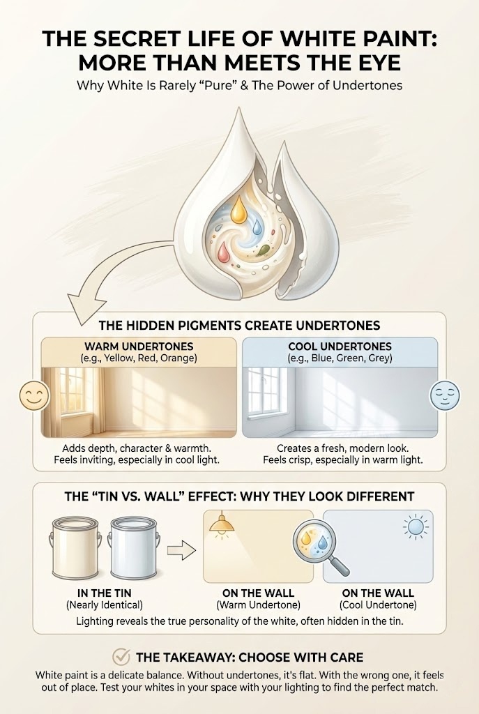
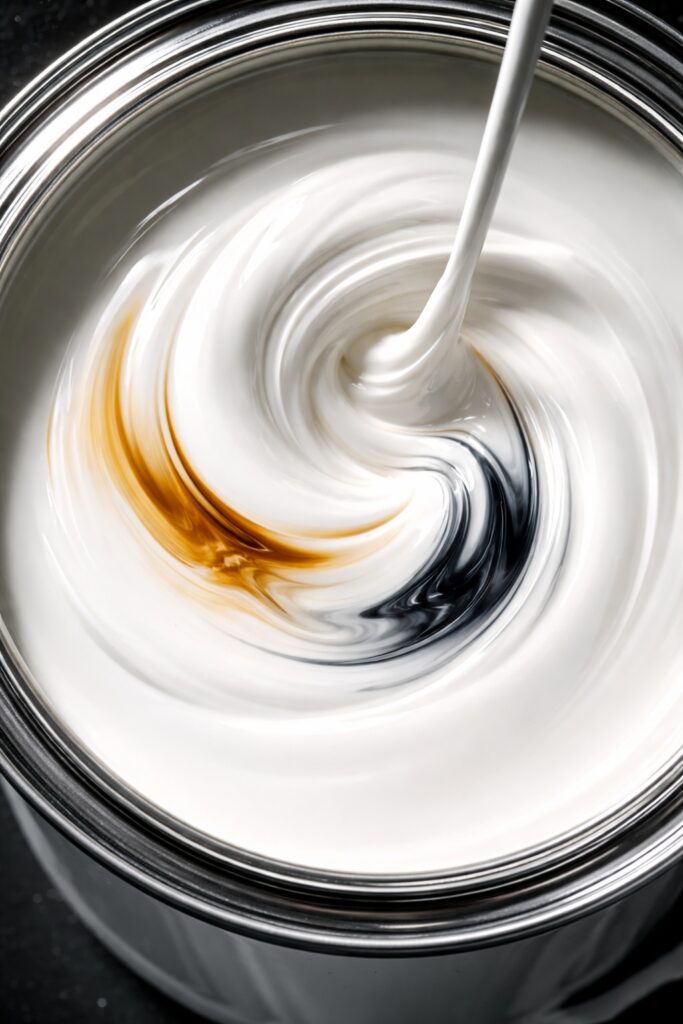
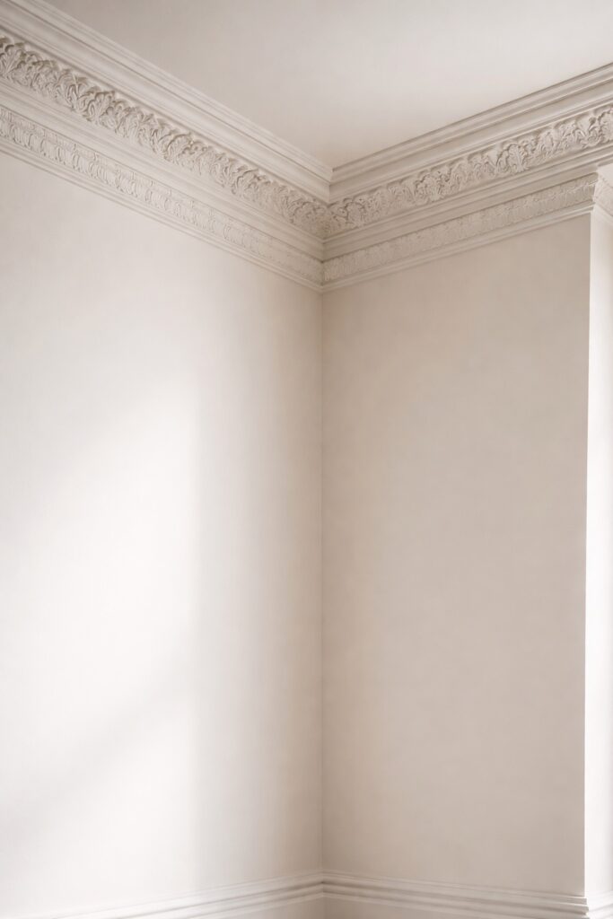
White paint is rarely pure white. Most whites are carefully balanced with small amounts of other pigments to give them depth and character. These pigments create undertones, which influence how the colour behaves in different environments.
Without undertones, white can look flat and lifeless. With the wrong undertone, it can feel uncomfortable or out of place. This is why two whites can look nearly identical in the tin but completely different once painted.
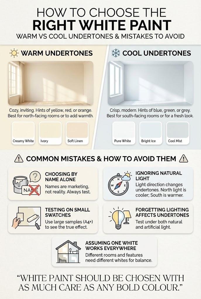
Understanding Undertones in Warm vs Cool White Paint
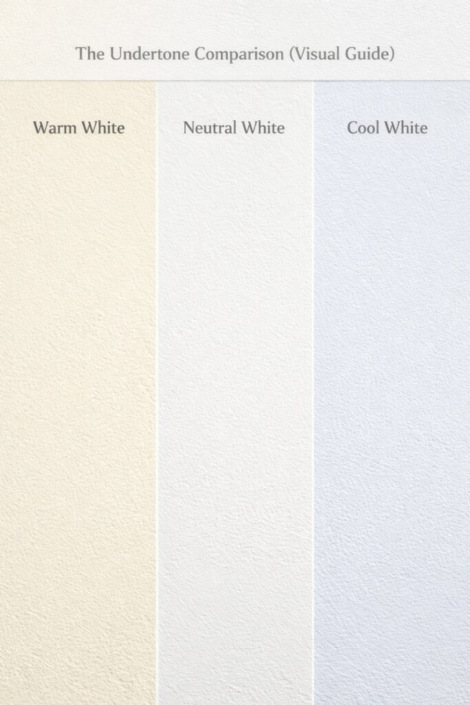
Undertones are subtle background hues that become visible depending on lighting, surrounding colours, and finishes. In white paint, undertones are usually warm or cool, although some fall into a neutral middle ground.
When comparing warm vs cool white paint, the key difference lies in how undertones respond to light and surrounding materials rather than how white the colour appears in the tin.
Warm undertones tend towards yellow, cream, or soft red.
Cool undertones lean towards blue, grey, or green.
These undertones are not always obvious at first glance. They reveal themselves over time, particularly in natural light or when placed next to other colours.
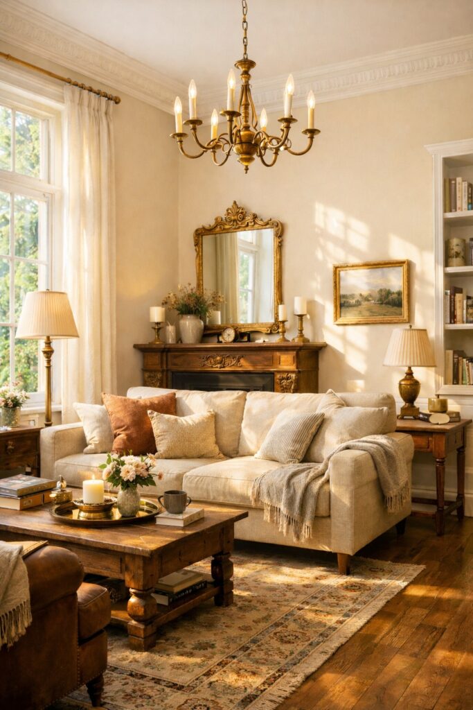
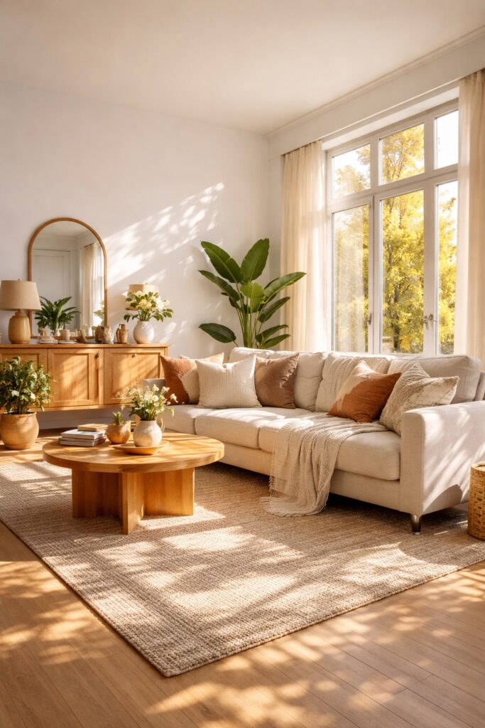
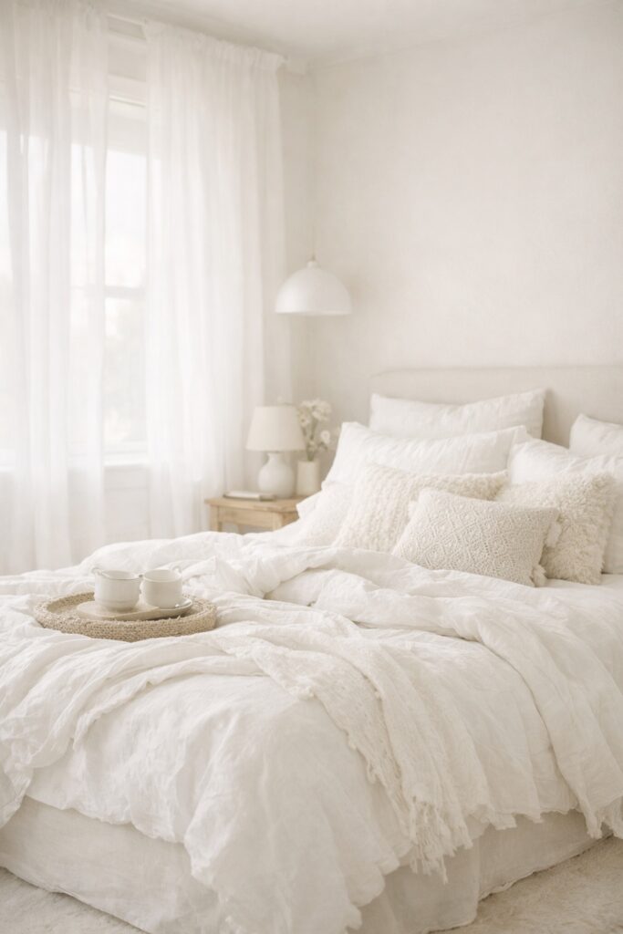
Warm White Paints: Soft and Inviting
Warm whites are ideal when you want a space to feel comfortable, welcoming, and lived in. They work particularly well in homes that prioritise warmth and character over sharp contrast.
When warm whites work best
Warm whites are a strong choice in:
- Living rooms where comfort matters most
- Bedrooms where a calm, restful feel is desired
- Period properties with traditional features
- North facing rooms that receive cooler daylight
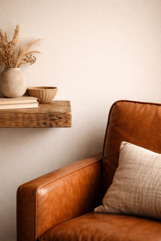
Warm whites also complement natural materials beautifully. Wood, stone, leather, and brass all feel richer against a warm white backdrop.
Things to watch out for
In rooms with very strong sunlight, warm whites can sometimes appear creamier or more yellow than expected. This is not always a problem, but it is worth testing to make sure the warmth does not overpower the space.
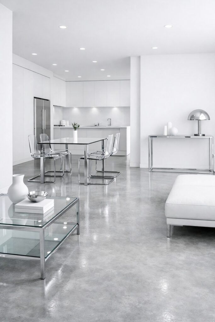
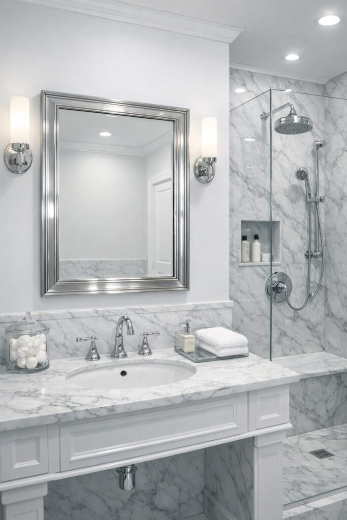
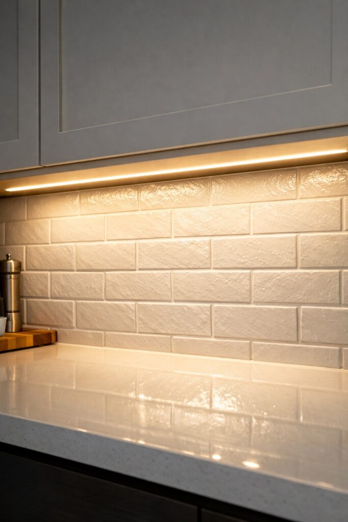
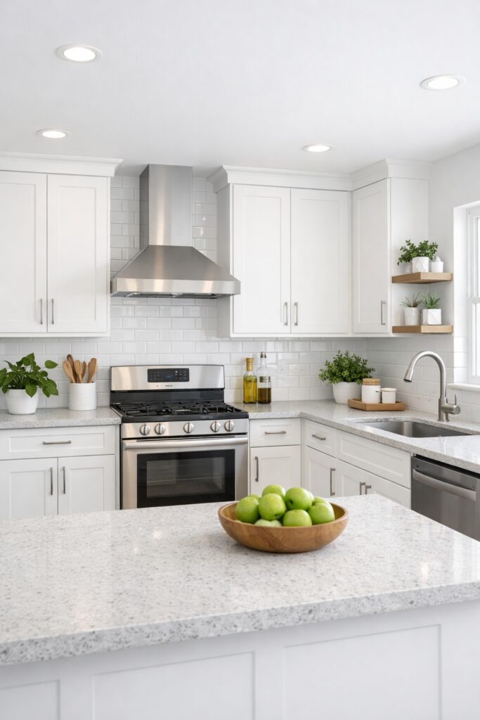
Cool White Paints: Clean and Contemporary
Cool whites create a sense of clarity and structure. They are often associated with modern interiors and spaces where cleanliness and brightness are key.
When cool whites work best
Cool whites are particularly effective in:
- Kitchens and utility rooms
- Bathrooms and en suites
- Modern homes with minimal detailing
- South facing rooms with plenty of daylight
They work well alongside polished surfaces such as marble, quartz, chrome, and concrete, helping these materials feel sharp and intentional.
Things to watch out for
In rooms with limited natural light, cool whites can feel stark or unwelcoming. Without enough warmth from furnishings or lighting, they may appear grey or slightly blue.
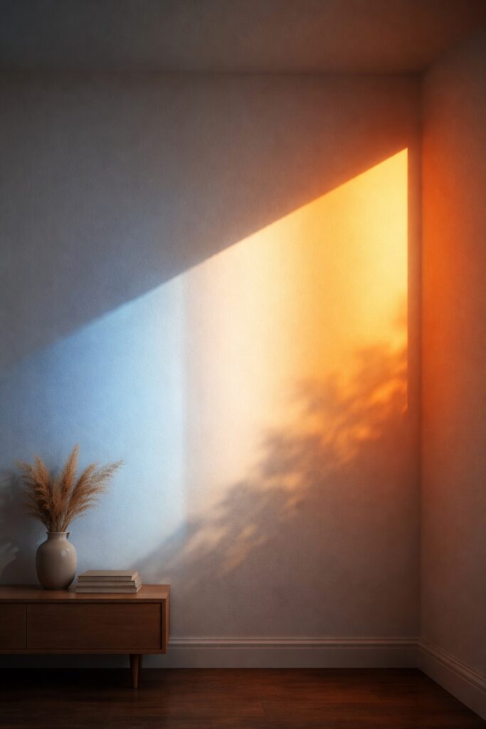
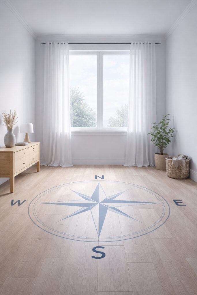
The Role of Natural Light
Natural daylight has a huge impact on how white paint appears once it is on the wall. The same shade can look soft and warm in one room, then cool and flat in another. This is because daylight changes throughout the day and interacts with undertones in different ways. A useful reference on how light affects paint colour explains why whites often shift depending on both the direction of the room and the time of day. In spaces with cooler natural light, undertones become more noticeable, which is why testing in the actual room is essential.
North facing rooms receive cooler, bluer daylight for most of the day, which can make white paint feel greyer or colder than expected. Warm white shades tend to work better in these conditions because they counteract the cool light and create balance. Guidance on north facing rooms and colour choice highlights why creams and warmer whites are often more successful than crisp whites in these spaces. Choosing the wrong undertone in a north facing room is one of the most common reasons white paint feels uninviting.
South facing rooms benefit from warmer daylight, which enhances warm undertones and softens cool whites. This gives you more flexibility in your choice.
East and west facing rooms change dramatically as the sun moves. Undertones can become more noticeable at certain times, making testing especially important.
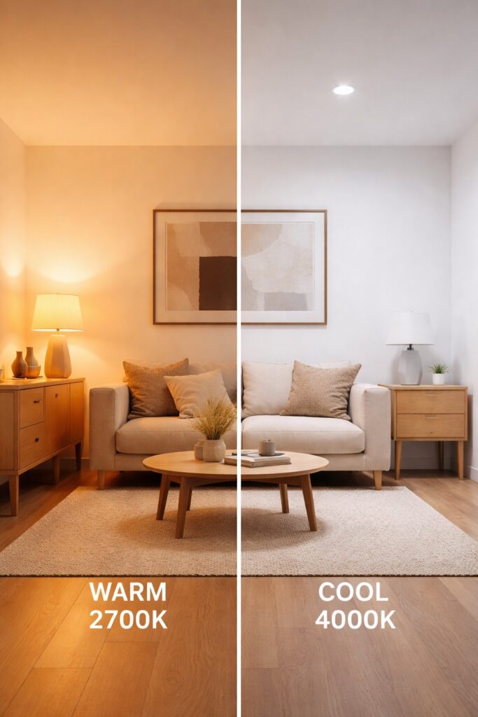
How Artificial Lighting Changes White Paint
Artificial lighting can dramatically change how white paint reads, especially in the evening. Warm bulbs enhance yellow and cream undertones, while cooler LEDs can pull out blue or grey tones. Understanding the colour temperature of LED lighting helps explain why a white paint that looks perfect during the day may feel completely different at night. Matching your paint choice to your bulb temperature is one of the easiest ways to keep white looking consistent.
Warm bulbs enhance yellow and cream undertones, making warm whites feel cosier but potentially too soft.
Cool LEDs highlight blue and grey undertones, which can make cool whites appear crisper or colder.
Mixed lighting can cause the same white to look different across walls and ceilings.
Matching your paint choice to your bulb temperature – ideally using High CRI LED Bulbs to show true colour – is one of the easiest ways to keep white looking consistent
Choosing White for Different Rooms
Living rooms
A warm or neutral white creates a relaxed environment that feels welcoming at all times of day. This is especially important in spaces used for evening relaxation.
Bedrooms
Warm whites support a calming atmosphere and work well with layered textiles. Cooler whites can work in minimalist bedrooms but benefit from warmer accents.
Kitchens
Cool or balanced whites keep kitchens feeling fresh and bright. They work well with white units, stone worktops, and reflective surfaces.
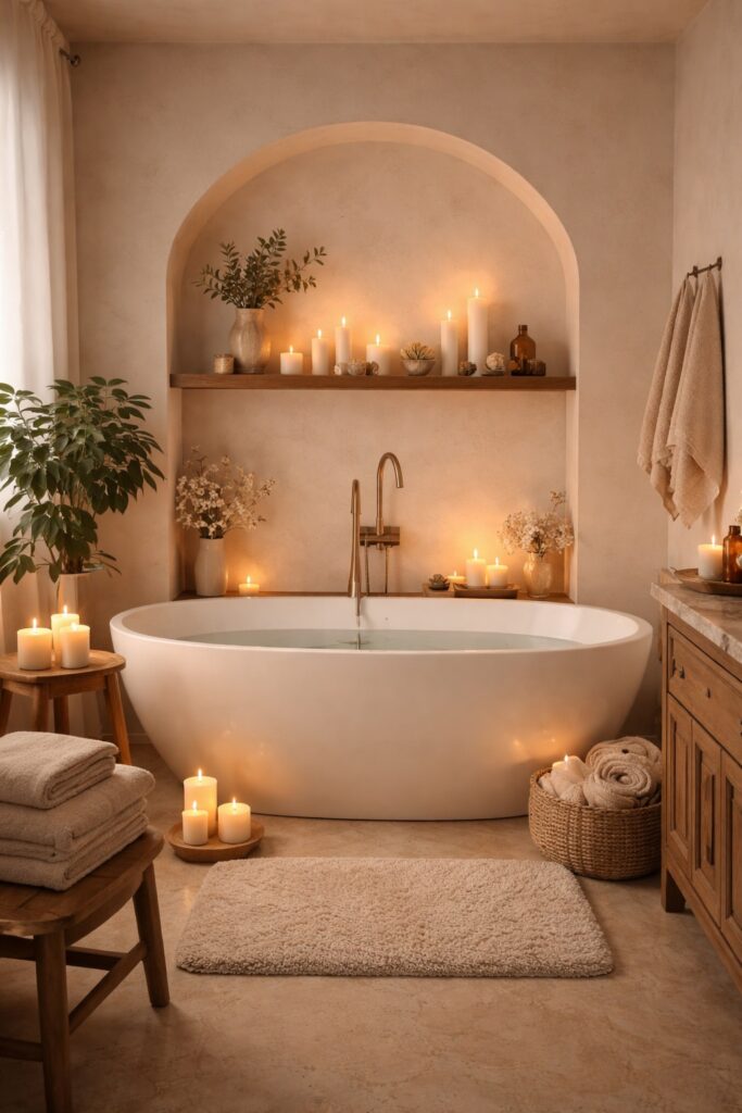
Bathrooms
Cool whites enhance brightness and cleanliness, especially in small or windowless bathrooms. Warmer whites can work in spa inspired spaces when paired with softer lighting.
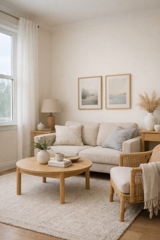
Neutral Whites: The Middle Ground
Neutral whites sit between warm and cool. They are designed to adapt rather than dominate.
These whites are ideal if:
- Your home has mixed lighting conditions
- You want consistency across multiple rooms
- You are pairing white with both warm and cool materials
Neutral whites are often the safest choice when you want flexibility without sacrificing depth.
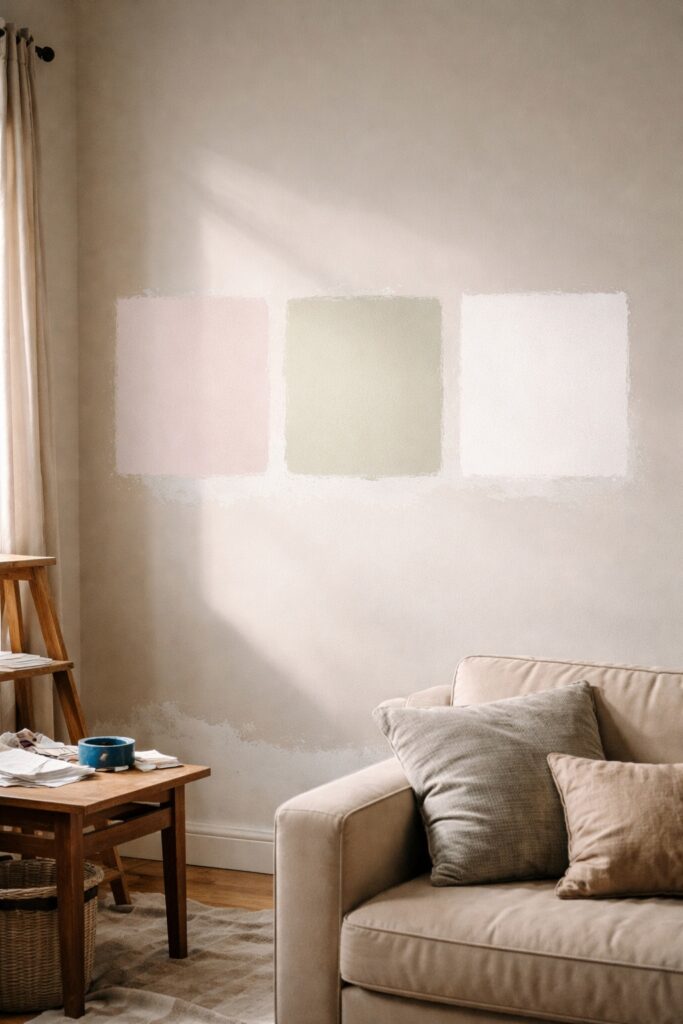
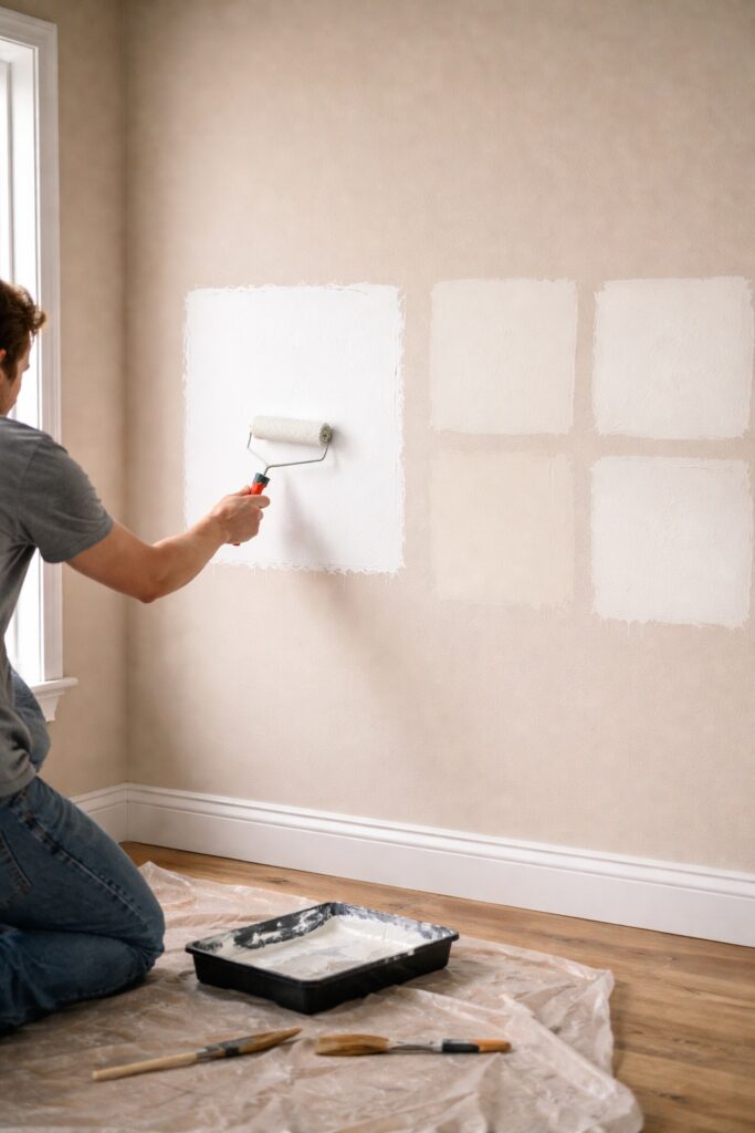
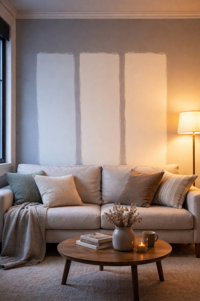
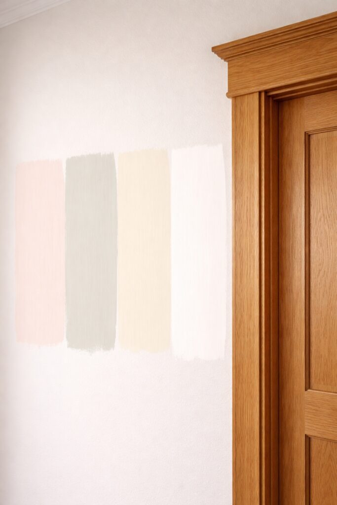
How to Test White Paint Properly
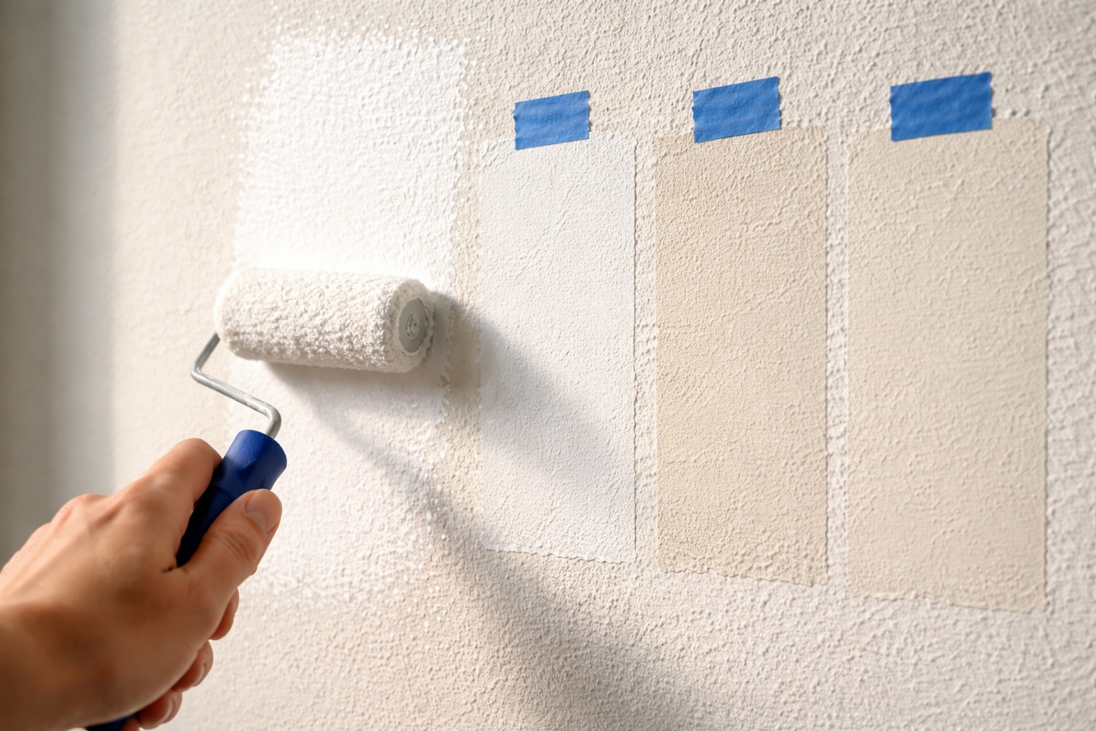
Testing white paint should always be done directly on the wall rather than on small cards. Large samples reveal undertones far more clearly and show how the colour responds to light throughout the day. Advice on testing paint samples on walls recommends viewing your samples in both natural and artificial light before making a final decision. This step helps avoid costly mistakes and ensures the white you choose works in real conditions, not just in theory.
Paint large samples directly onto your walls (or use Peel-and-Stick Sample Decals to avoid mess) rather than relying on small cards
Subtle differences become far clearer when viewed together, especially if you mask off the old colour with quality painter’s tape to get a clean visual break.
Common White Paint Mistakes to Avoid
- Choosing white based on the name alone
- Ignoring the direction of natural light
- Testing only on small swatches
- Forgetting how lighting affects undertones
- Assuming one white works everywhere
White paint should be chosen with as much care as any bold colour.
Is warm white or cool white better for small rooms?
Warm white is often better for small rooms because it softens edges and makes the space feel less stark. In well lit small rooms, a neutral white can also work well.
Why does white paint look grey on my walls?
This usually happens in rooms with limited natural light or cool LED bulbs. Grey or blue undertones become more visible in these conditions.
Can I use the same white paint throughout my home?
Yes, but a neutral white is usually the safest option. It adapts better to different lighting conditions from room to room.
Should ceilings be the same white as walls?
They can be, but many people choose a slightly cleaner or brighter white on ceilings to maintain height and clarity.
How many white paint samples should I test?
Testing two to three whites side by side is ideal. This makes undertones much easier to spot.
Final Thoughts
White paint is not a blank canvas. It is a design decision that shapes how a space feels every day. Warm whites bring comfort and softness, while cool whites offer clarity and structure. By understanding undertones and testing properly, you can choose a white that feels intentional, balanced, and timeless.