The psychology of color plays a powerful role in how we experience calm, comfort, and relaxation in interior spaces.
Colour has a powerful influence on how we feel in a space. Long before furniture, lighting, or décor are noticed, colour sets the emotional tone of a room. Some shades energise and stimulate, while others calm the mind and help the body unwind.
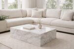
In living rooms, bedrooms, and other spaces designed for rest, colour choice plays a particularly important role. The right paint shade can make a room feel peaceful, balanced, and comfortable. The wrong one can create subtle tension, even if the room looks visually appealing.
This guide explores the psychology of colour and explains which paint shades are best for creating a relaxed, restorative atmosphere. Rather than focusing on trends, it looks at how colour actually affects mood, perception, and comfort, helping you make choices that stand the test of time.
Some of the links in this post are affiliate links. If you click through and make a purchase, we may earn a small commission at no extra cost to you. We only recommend products we naturally use and love.
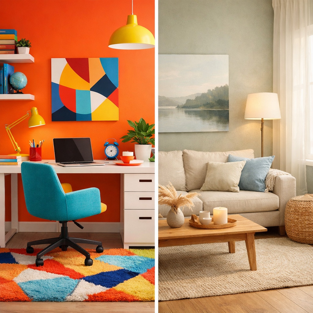
Table of Contents
How Colour Affects Mood and Emotion
Colour psychology is based on how the brain responds to different wavelengths of light. While personal experience and culture play a role, there are consistent emotional responses that many colours trigger.
Warm colours such as red, orange, and yellow tend to stimulate the nervous system. They can feel welcoming and energising, but in excess they may create restlessness or visual fatigue.
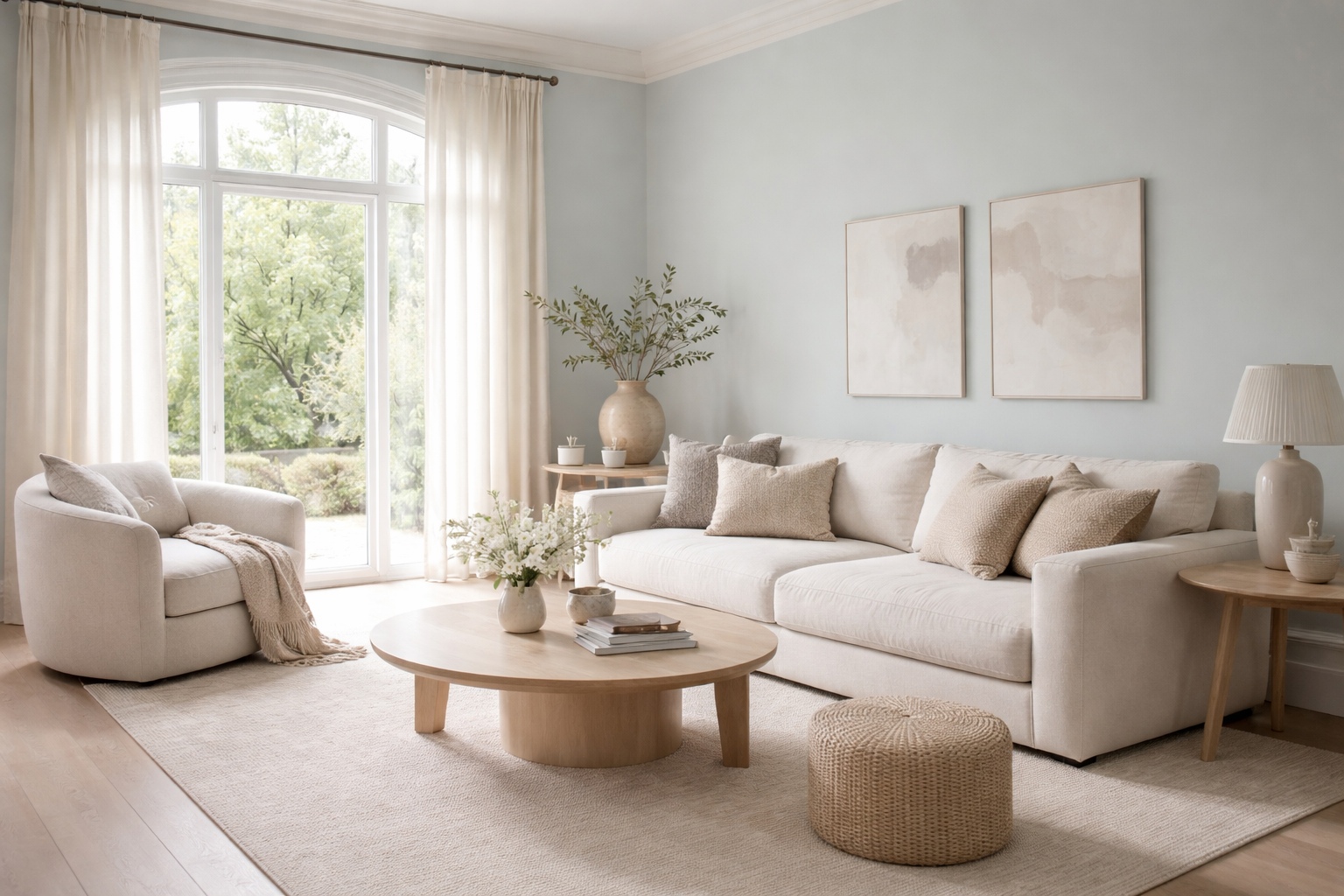
Cool colours such as blue, green, and soft violet generally have a calming effect. They lower perceived temperature, reduce visual noise, and encourage slower, more relaxed responses.
Neutral colours act as emotional stabilisers. They rarely dominate a space but instead create a backdrop that allows the mind to rest.
When choosing paint shades for relaxation, the goal is to reduce visual tension rather than create excitement.
Research into colour psychology shows that different hues can influence mood, focus, and emotional response.
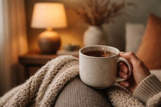
Why Relaxing Colours Matter in Living Spaces
Living rooms and shared spaces often serve multiple purposes. They are places to unwind, socialise, read, and spend quiet time. A relaxing colour palette helps these activities coexist without the room feeling overstimulating.
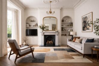
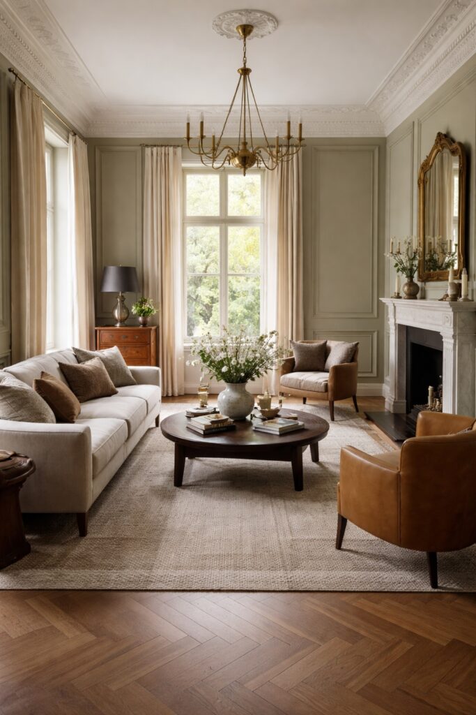
In period properties especially, colour also interacts with architectural details such as cornicing, panelling, and fireplaces. A calming shade can soften ornate features and make a room feel more cohesive, while harsh colours can exaggerate contrast and visual clutter.
Relaxing colours do not mean boring colours. Subtle depth, undertones, and texture matter more than brightness.
Understanding the psychology of color helps explain why certain paint shades feel more relaxing than others.

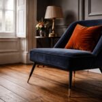
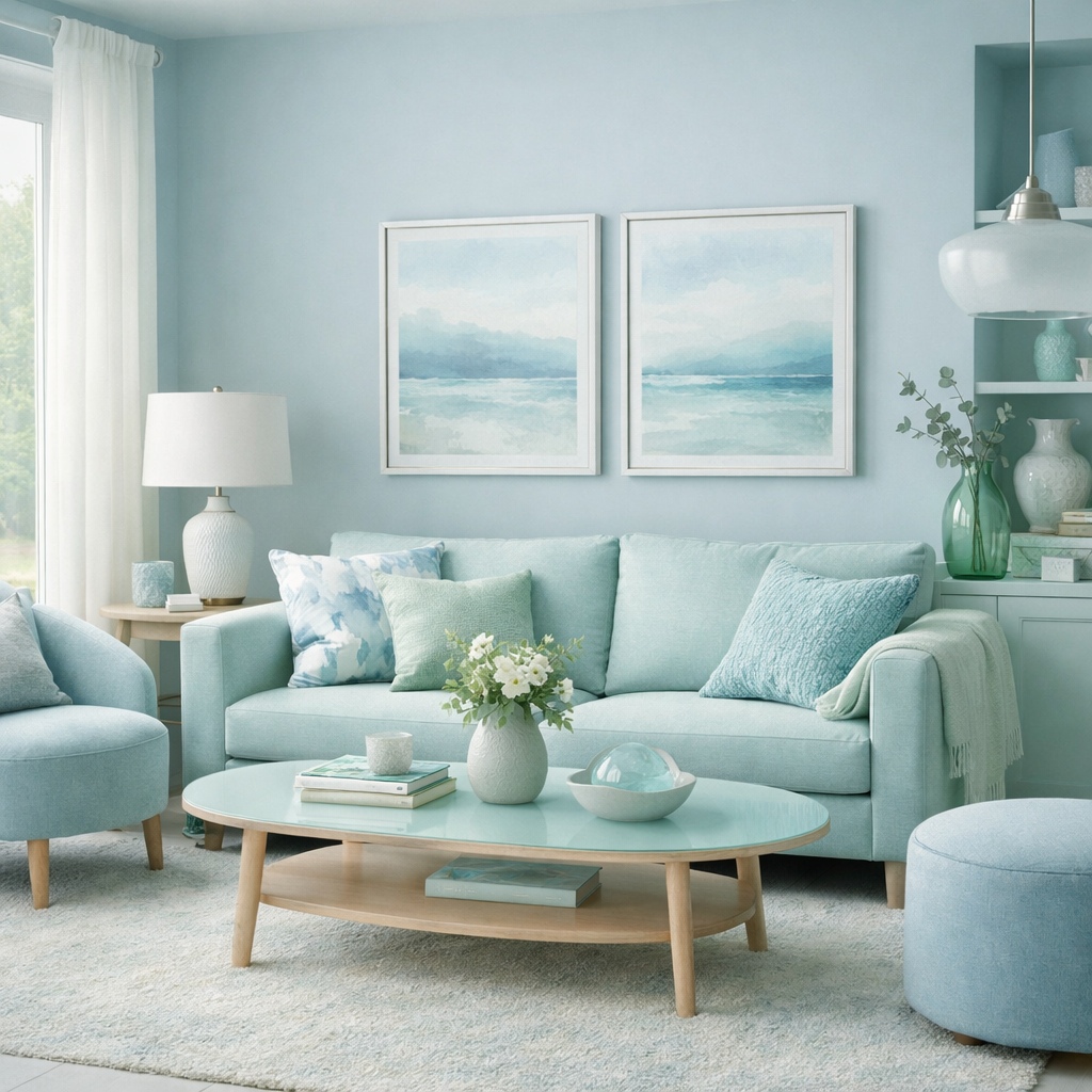
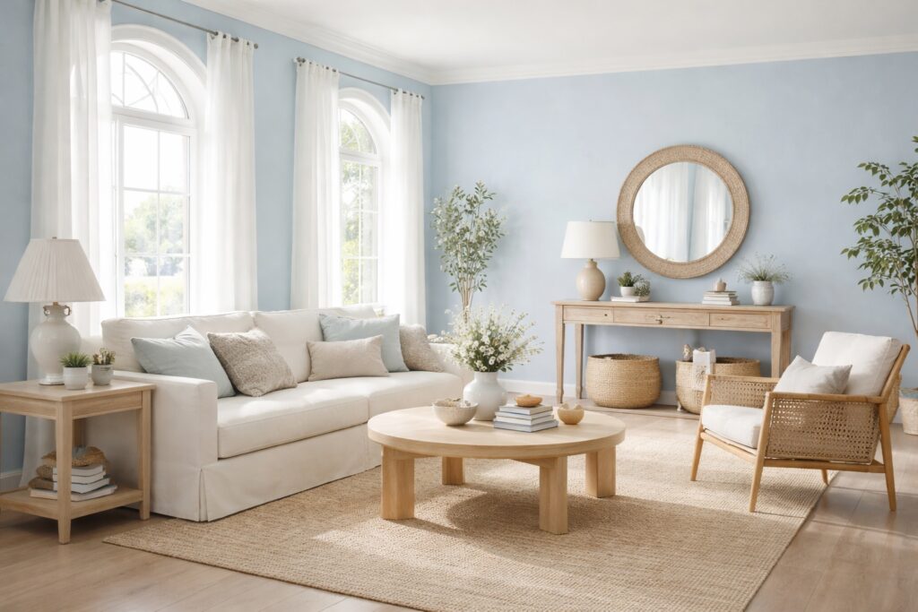
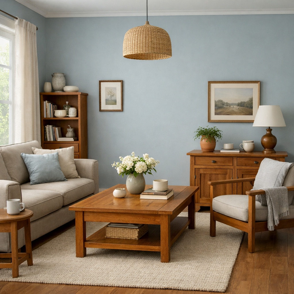
Soft Blues: Calm, Clarity, and Balance
Blue is one of the most widely recognised calming colours. It is associated with the sky, water, and open spaces, which naturally encourages a sense of calm and mental clarity.
For relaxation, softer blues work better than strong or highly saturated tones. Pale blue greys, muted duck egg shades, and dusty blues create a tranquil atmosphere without feeling cold.
In living rooms, soft blue walls can:
- Lower perceived stress
- Make spaces feel lighter and more open
- Create a gentle contrast with warm wood or traditional features
Avoid very bright or icy blues in relaxation focused rooms, as they can feel stark rather than soothing.
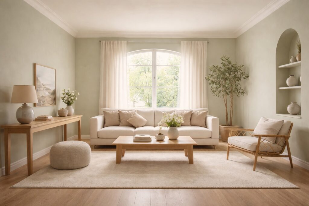
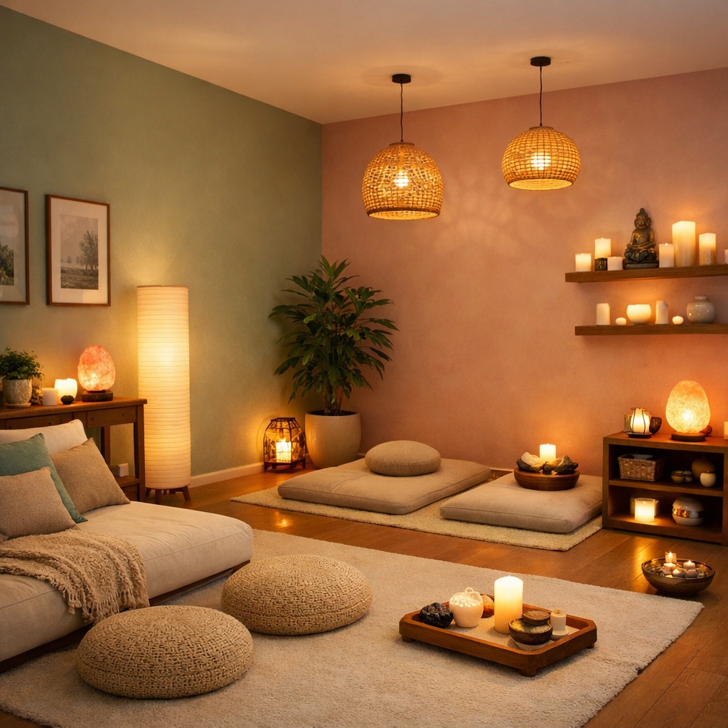
Greens: Nature, Restoration, and Comfort
Green sits at the centre of the colour spectrum and is one of the easiest colours for the eye to process. This makes it naturally restful.
Soft greens, sage tones, and muted olive shades are particularly effective for relaxation. They reference nature without overpowering the space and work well in both modern and traditional interiors.
Green is especially useful in period properties because it complements original materials such as stone, wood, and plaster. It also pairs well with both warm and cool lighting, maintaining balance throughout the day.
Lighter greens feel fresh and calming, while deeper muted greens create a sense of security and enclosure.

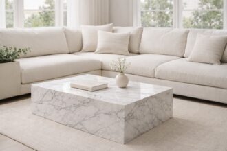
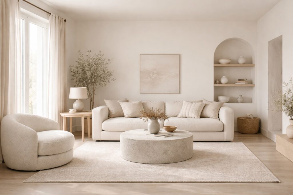
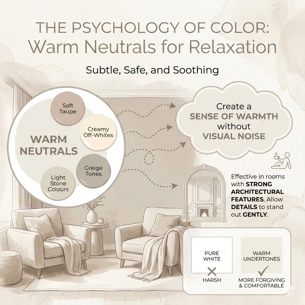
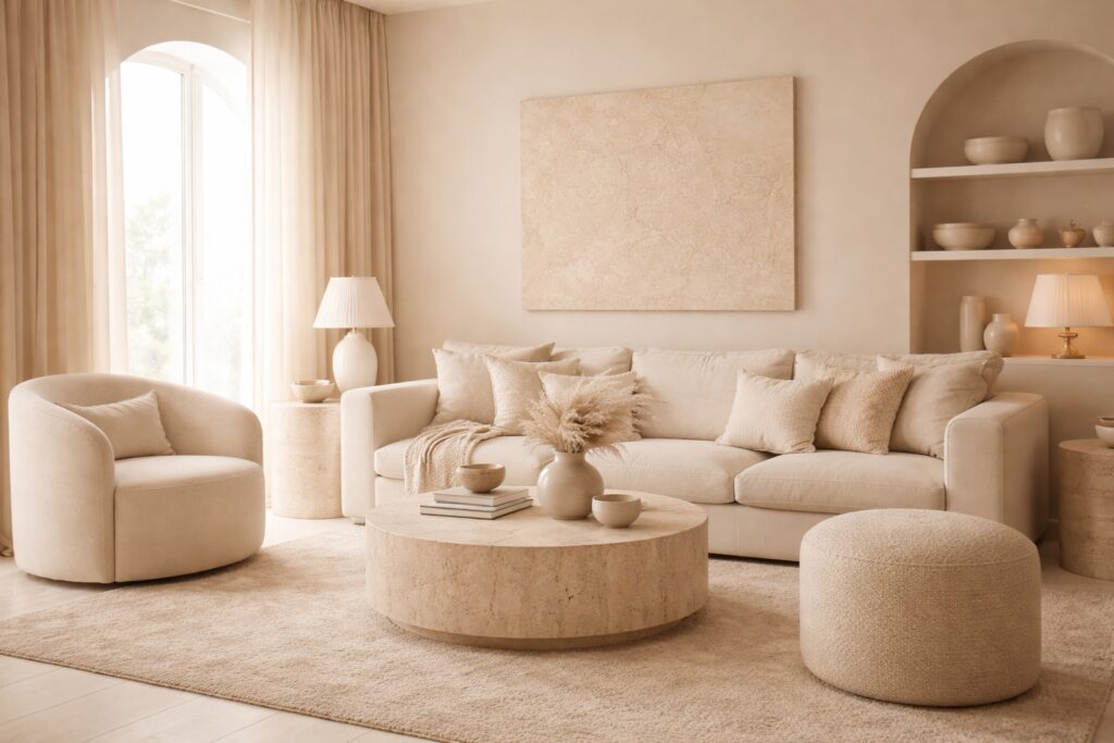
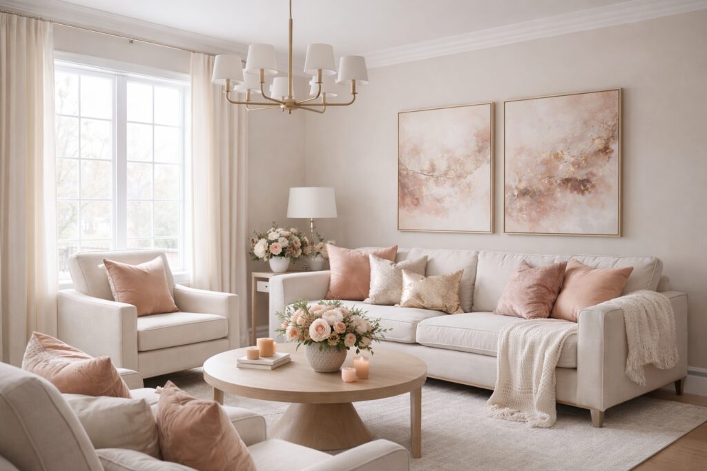
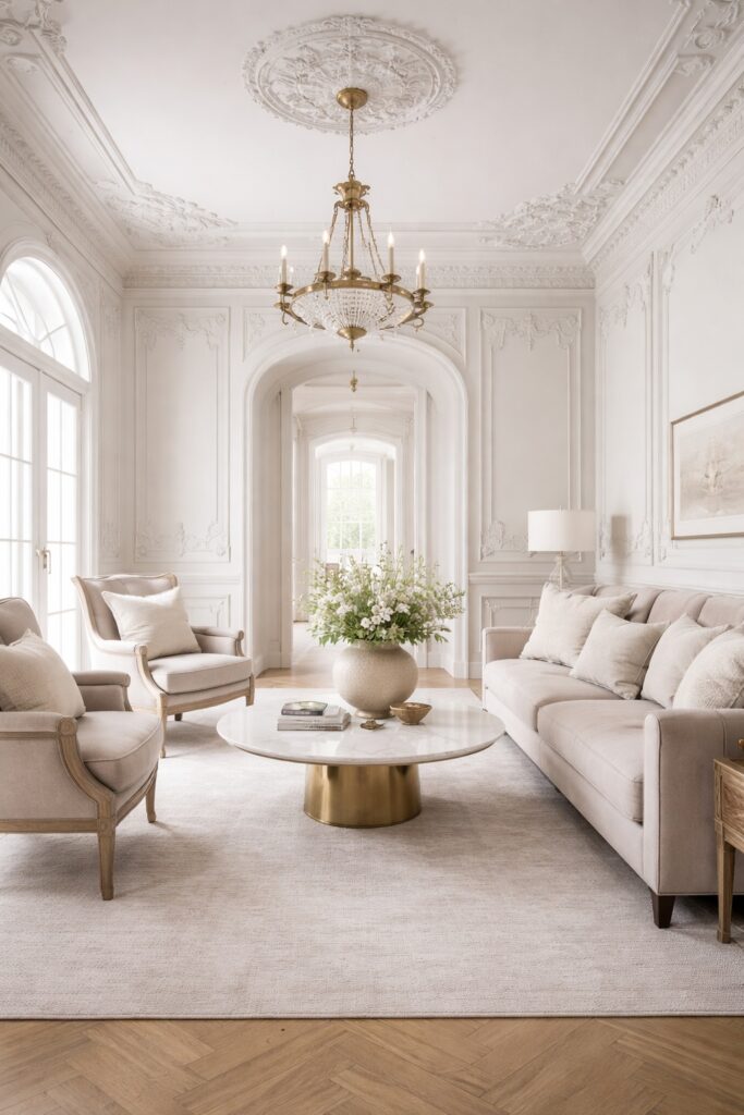
Warm Neutrals: Subtle, Safe, and Soothing
Neutral colours are often underestimated in discussions about relaxation. When chosen carefully, they are some of the most calming shades available.
Warm neutrals such as:
- Soft taupe
- Creamy off whites
- Greige tones
- Light stone colours
create a sense of warmth without visual noise.
These shades are particularly effective in rooms with strong architectural features. They allow details to stand out gently rather than compete for attention.
Pure white can feel harsh in relaxation spaces. Softer neutrals with warm undertones tend to feel more forgiving and comfortable.
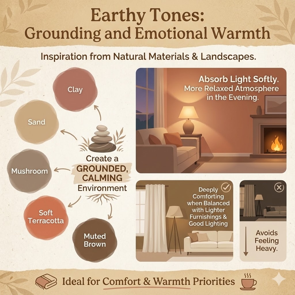
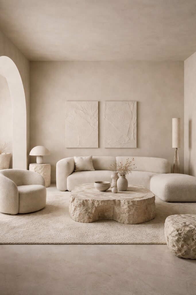
Earthy Tones: Grounding and Emotional Warmth
Earthy colours draw inspiration from natural materials and landscapes. Clay, sand, mushroom, soft terracotta, and muted brown based tones can all create a grounded, calming environment.
These shades work especially well in rooms where comfort and warmth are priorities. They tend to absorb light softly rather than reflect it harshly, which contributes to a more relaxed atmosphere in the evening.
Earthy tones are often overlooked for living rooms, but when balanced with lighter furnishings and good lighting, they can feel deeply comforting rather than heavy.
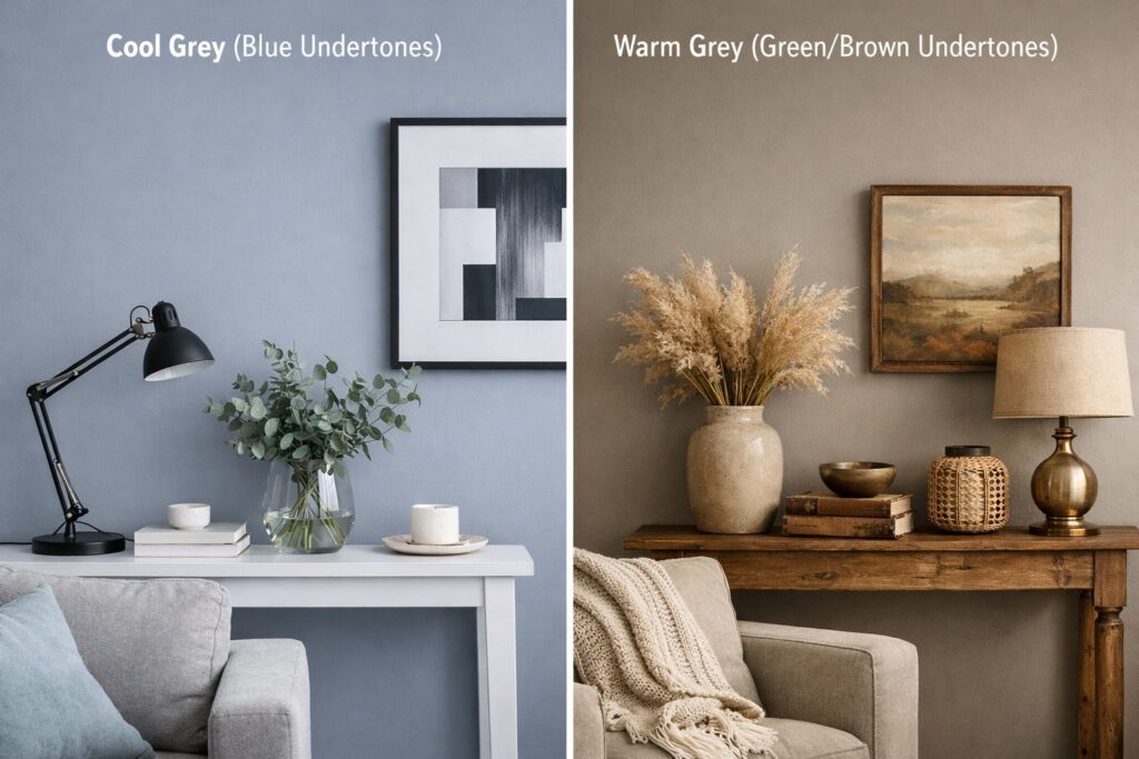
How Undertones Influence Relaxation
Two colours that appear similar can feel very different depending on their undertones.
A grey with blue undertones will feel cooler and calmer, while a grey with green or brown undertones will feel warmer and more enveloping. Understanding undertones is essential when choosing relaxing paint shades.
Always test peel-and-stick paint samples in different lighting conditions. Natural daylight, warm evening lighting, and artificial light can all shift how a colour feels emotionally.
A relaxing colour should feel consistent and comfortable throughout the day, not just at one moment.
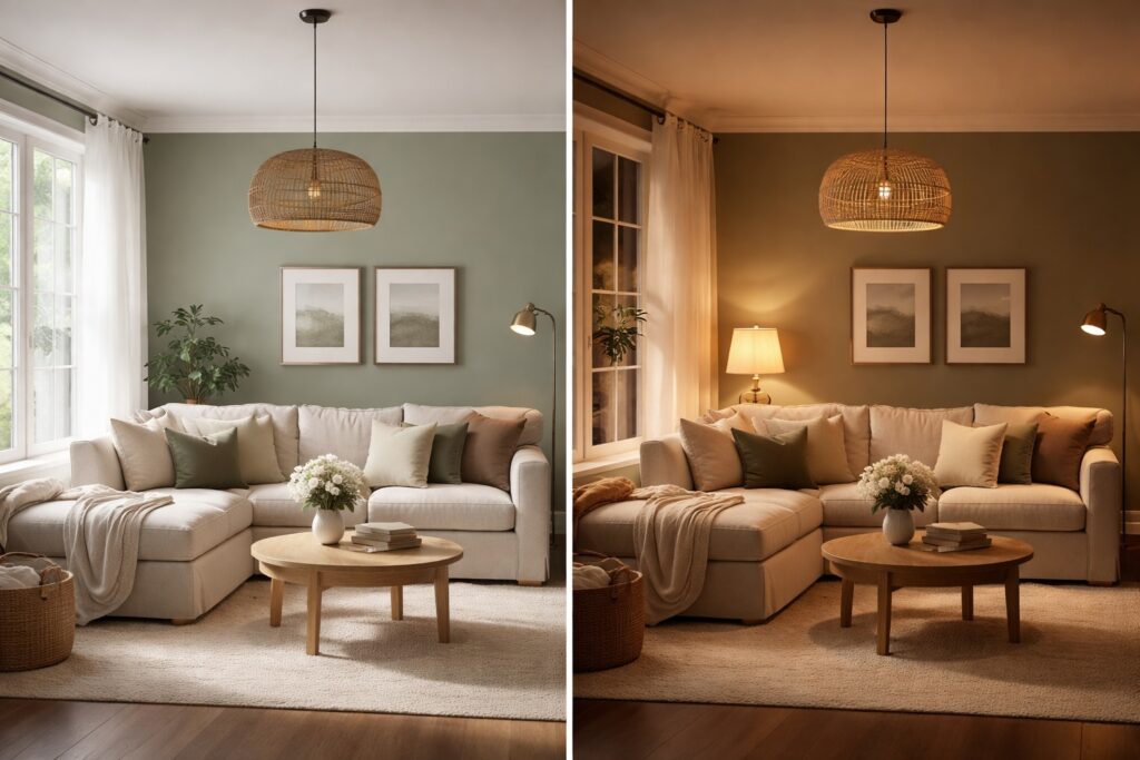
The Role of Light in Colour Psychology
Lighting and colour are inseparable.
A paint shade that feels calming in daylight may feel flat or dull under artificial light if the lighting temperature is wrong. Warm lighting tends to enhance earthy tones and warm neutrals, while cooler lighting works better with blues and some greens.
For relaxation focused rooms, layered lighting is essential. Soft ambient light reduces harsh shadows and allows colours to appear more natural and soothing.
Colour should always be chosen with lighting in mind, not in isolation.
Using Colour to Create Visual Quiet
Relaxation comes from visual simplicity as much as colour choice.
Using one dominant colour with subtle variations is often more calming than using multiple contrasting shades. Tone on tone schemes reduce visual fragmentation and help the eye move smoothly around the room.
This does not mean everything must match exactly. Variation through texture, finish, and material keeps the room interesting without creating stress.
Paint colour should support the space, not demand attention.
Accent Colours Without Losing Calm
Accent colours can still be used in relaxing spaces, but they should be introduced with restraint.
Soft blush tones, muted blues, gentle charcoal, or warm metallics can add depth without overwhelming the palette. The key is limiting contrast and keeping accents secondary to the main colour.
In living rooms, accents are often better introduced through furnishings, artwork, or textiles rather than paint. This keeps the core environment calm and adaptable.
Colour Psychology in Period Properties
In period homes, colour interacts strongly with architectural detail.
Highly saturated colours can exaggerate mouldings and panelling, making the room feel busy. Softer shades allow these features to remain visible without dominating the space.
Historically inspired colours often work well, but they should be interpreted through a modern lens. Muted, contemporary versions of classic shades tend to feel more relaxing than bold historical recreations.
Choosing calming colours helps bridge the gap between traditional architecture and modern living.
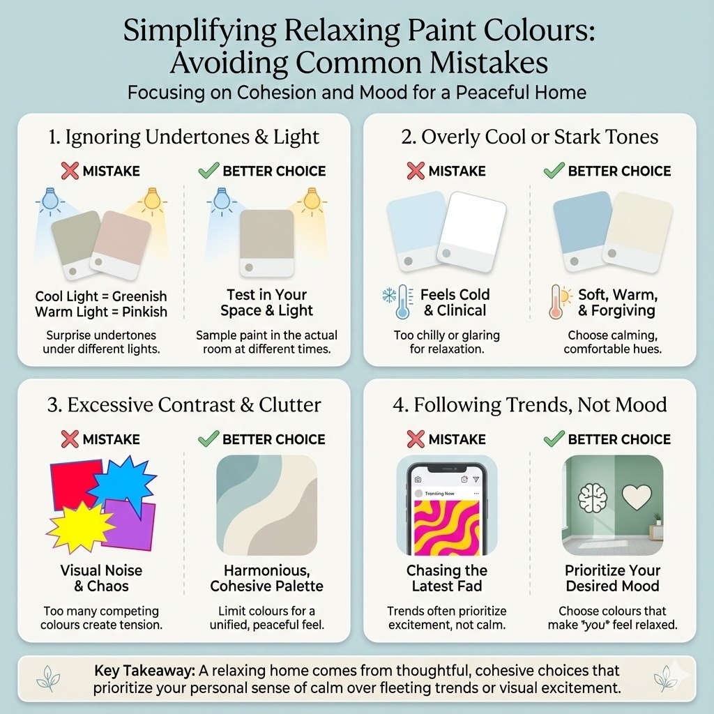
Common Mistakes When Choosing Relaxing Paint Colours
Some common pitfalls include:
- Choosing colour purely from trends rather than mood
- Using overly cool shades that feel clinical
- Ignoring undertones and lighting
- Adding too many contrasting colours
- Using bright whites in spaces meant for rest
Make sure you use high-quality painter’s tape to keep lines crisp if you do use accents
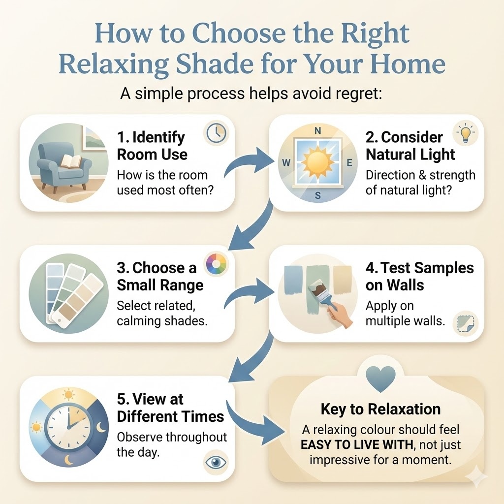
How to Choose the Right Relaxing Shade for Your Home
A simple process helps avoid regret:
- Identify how the room is used most often
- Consider natural light direction and strength
- Choose a small range of related shades
- Test samples on multiple walls
- View them at different times of day
A relaxing colour should feel easy to live with, not impressive for a moment.
| Colour Family | The “Safe” Choice | Best For… |
| Soft Blue | Farrow & Ball ‘Light Blue’ | South-facing rooms (Balances bright light). |
| Calm Green | Little Greene ‘Ambleside’ | Bringing the outside in. |
| Warm Neutral | Dulux ‘Egyptian Cotton’ | North-facing rooms that feel cold. |
| Earthy Tone | Farrow & Ball ‘Setting Plaster’ | Evening snugs and bedrooms. |
What is the most relaxing colour for a living room?
Soft blues, muted greens, and warm neutrals are the most relaxing choices. These shades reduce visual noise and create a calm atmosphere.
Are neutral colours good for relaxation?
Yes. Warm neutrals provide a stable, soothing backdrop and work well in spaces designed for rest.
Does colour really affect mood?
Yes. Colour influences how we perceive space and light, which directly affects mood and comfort.
Is blue always calming?
No. Muted blues are calming, but very bright or highly saturated blues can feel cold or overstimulating.
How does lighting affect paint colour?
Lighting changes how colour appears. A shade can feel calming in daylight but harsh under artificial light if lighting is not considered.
Are warm colours bad for relaxation?
Not always. Soft warm tones like taupe and earthy shades can feel calming when used in moderation.
Should every room use relaxing colours?
No. Relaxing colours work best in living rooms and bedrooms. Active spaces benefit from more energising colours.
How should I test a relaxing paint colour?
Test samples on different walls and view them at different times of day to judge comfort, not just appearance.
Final Thoughts: Calm Is a Design Choice
Creating a relaxing space is not about removing personality or colour. It is about making intentional choices that support comfort and emotional balance.
The best paint shades for relaxation are those that reduce visual noise, complement natural light, and work harmoniously with the architecture of the space.
When colour is chosen thoughtfully, the room becomes somewhere you naturally want to spend time, unwind, and feel at ease.